

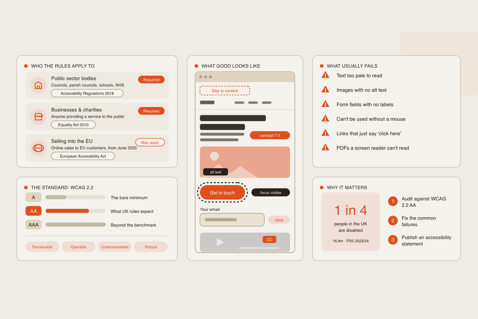

Well over 14 million people in the UK are disabled — more than one in five of the population. Many use screen readers, voice control, captions, keyboard-only navigation, or high-contrast settings to access the web. Others have temporary or situational needs: a broken wrist, a bright sunny screen, a noisy train carriage, or simply tired eyes at the end of a long day. If your site doesn't work for these visitors, they won't struggle through it. They'll go to a competitor, or in the case of a charity, to another cause. That is a large group of potential customers, supporters and donors you could be turning away without ever knowing.
What does the law say?
In the UK, the Equality Act 2010 requires organisations providing goods and services to make reasonable adjustments so disabled people can access them — and a website is generally treated as a service. Public sector bodies have additional, more specific accessibility regulations. The Act doesn't name a technical standard, but the Web Content Accessibility Guidelines (WCAG) 2.2 at Level AA are widely regarded as the benchmark for what “reasonable” looks like.
We're web designers, not solicitors, and this isn't legal advice — if you have specific concerns about your obligations, it's worth speaking to a legal professional. But the direction of travel is clear: accessibility is moving from nice-to-have to expected.
Common problems we see on older websites
Most accessibility failures are surprisingly simple, and surprisingly common:
- Low-contrast text. Pale grey on white may look elegant, but it's unreadable for many people.
- Images with no description. Without alt text, screen reader users hear nothing — or just a file name.
- You can prioritise fixes: unclear links and buttons. A string of “click here” links tells assistive technology nothing about where they lead.
- Videos without captions. Excluding deaf and hard-of-hearing visitors — and everyone watching with the sound off.
- Tiny tap targets and cluttered layouts. Frustrating on a phone for anyone, and a barrier for people with limited dexterity.
Why it matters even more for charities and nonprofits
For nonprofits, accessibility is often tied directly to mission. Many charities serve people who are more likely to have access needs — older people, people with health conditions, people with learning difficulties. A donation form that can't be completed with a keyboard, or an information page a screen reader can't read, doesn't just lose a supporter; it can fail the very people you exist to help. Funders and trustees are also paying closer attention to inclusion, and an accessible website is a visible, practical demonstration of it.
What an accessible website feels like in practice
Done well, accessibility is invisible. Visitors simply find the site easy: text is comfortable to read, buttons are easy to hit, forms tell you clearly what went wrong, and every page makes sense whether you're looking at it, listening to it, or tabbing through it. Nobody notices good accessibility — they just notice that your site was easy to use, and that they didn't give up halfway through.
The bonus: accessible sites perform better
Here's the part that makes accessibility an easy sell. Many of the things that make a site accessible also make it better for search engines and for everyone else: clear headings, descriptive image text, readable fonts, logical structure, fast loading and sensible navigation. Google rewards well-structured, user-friendly pages, so an accessible website is very often a higher-ranking, higher-converting one.
Where to start
You don't need to rebuild everything overnight. A sensible first step is an accessibility check of your current site — automated tools catch some issues, but a human review catches the rest. From there, the fixes can be prioritised by impact. If your site is several years old, you may find that building accessibility into a fresh design is simpler and more cost-effective than patching the old one.
Let's take a look at yours
At Pennine Websites, we build accessibility into every site from the start, so your website welcomes everyone — and works harder for you as a result. If you'd like to know how your current site measures up, we're happy to have a look.
Get in touch for a free, friendly accessibility review of your website.
Pennine Website Design & Development is a freelance web design and development service based in Barnard Castle, Teesdale. We build bespoke, high-performance websites for businesses and non-profits across the North East.
Get in touch | View our work | See pricing
James McBain