Responsive Websites
In today's digital world, a responsive website is no longer a luxury—it’s a standard. Websites should work perfectly across all devices, from 4K monitors down to smartphones.

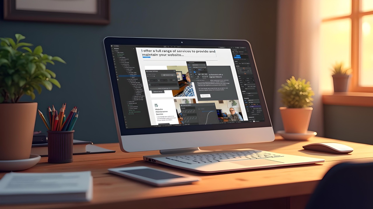
In today's digital world, a responsive website is no longer a luxury—it’s a standard. At its core, responsive web design (RWD) ensures a website looks and functions well across all devices, from large 4K monitors to the smallest smartphones.
Here is a breakdown of how it works and why it matters.
How It Works: The Three Pillars
Responsive design isn't about creating different versions of a site; it’s about creating one site that fluidly adapts.
- Fluid Grids: Instead of designing in fixed pixels (which break on different screens), layouts are built using relative units like percentages.
- Flexible Images: Images are scaled within their containing units so they don't "spill over" or become cut off on smaller screens.
- Media Queries: This is the CSS "brain" of the site. It allows the website to inspect the device's screen size and apply different styles accordingly (e.g., "If the screen is narrower than 600px, stack these three columns into one").
Key Benefits
- Improved User Experience (UX): Users don't have to "pinch and zoom" to read text or click buttons. Everything is sized appropriately for their input method (mouse vs. thumb).
- SEO Advantages: Google prioritises mobile-friendly websites in search results. Having one URL makes it easier for search engines to crawl and index your content.
- Cost-Effectiveness: It is much cheaper to maintain one responsive codebase than to develop and update separate apps or mobile-specific sites.
- Future-Proofing: Because the design is based on fluid percentages, it will likely look good on new devices and screen sizes that haven't even been released yet.
Best Practices
- Mobile-First Approach: Design for the smallest screen first, then add complexity as screen real estate increases. This ensures the most essential content is prioritised.
- Touch-Friendly Navigation: Ensure buttons are large enough to be tapped (usually at least 44x44 pixels) and that menus are easy to toggle on mobile.
- Performance Optimisation: Mobile users are often on slower connections. Compressing images and minimising code is vital for fast load times.
James McBain